
Spiced.
2023 / KANAGAWA
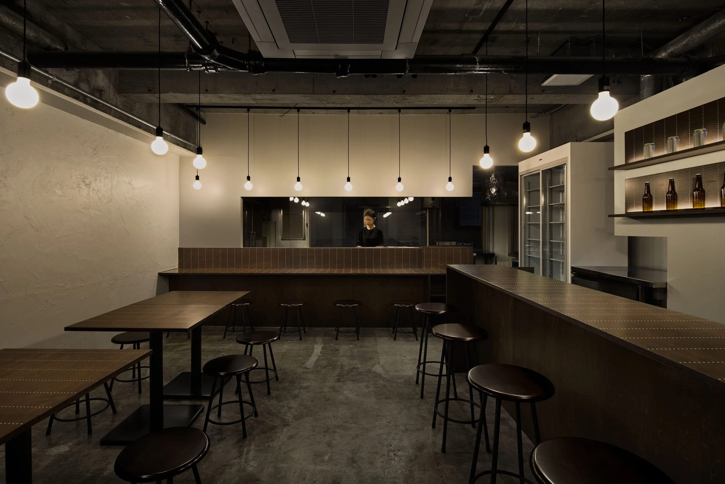
長年調理の世界に携わってきたオーナーによる、スパイスカレーとクラフトビールを中心とした飲食店である。
食や健康に関心のある若い人たちにスパイスの魅力を知って欲しいという想いを受け、既存のスケルトン空間を活かしながら、オーナーの経験や専門知識が感じられる様な落ち着きのあるカラースキームでまとめた。
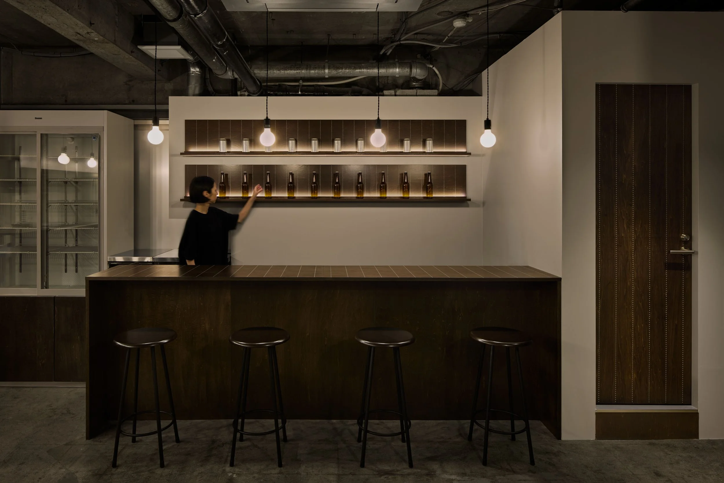
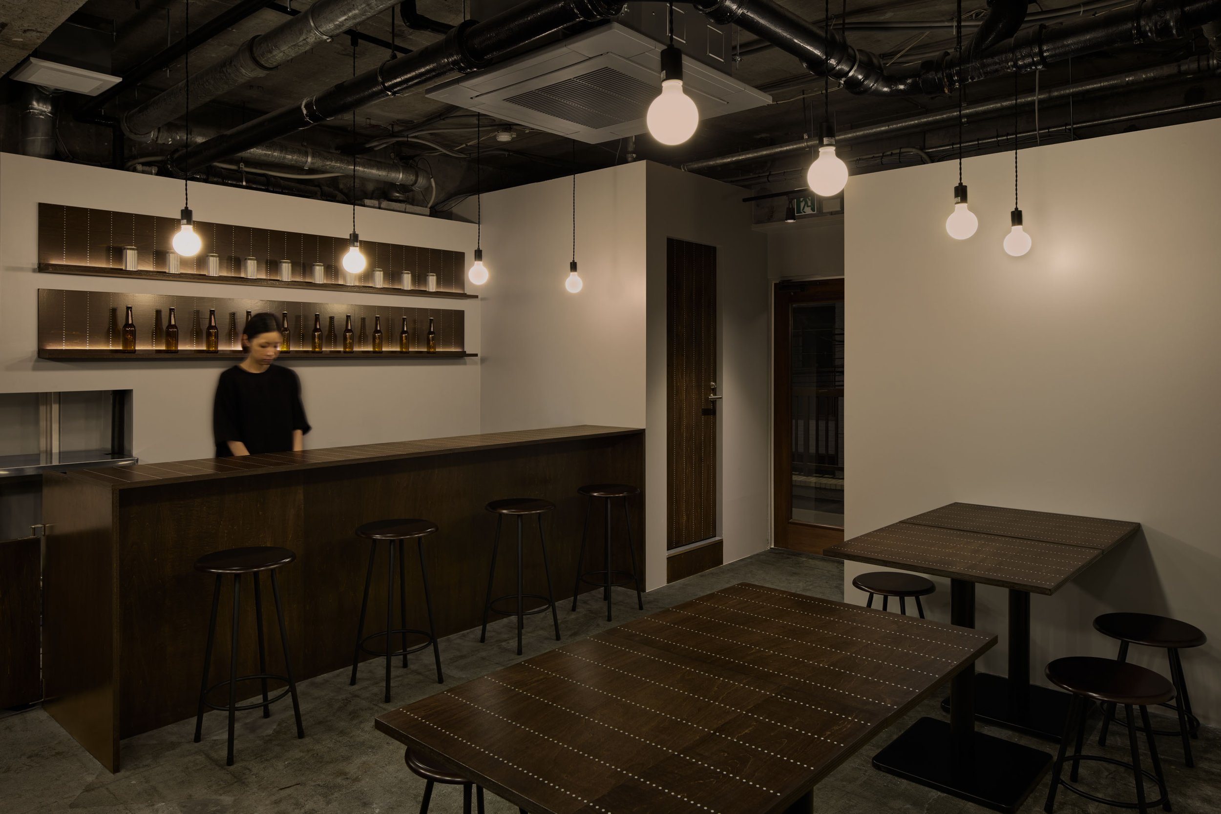
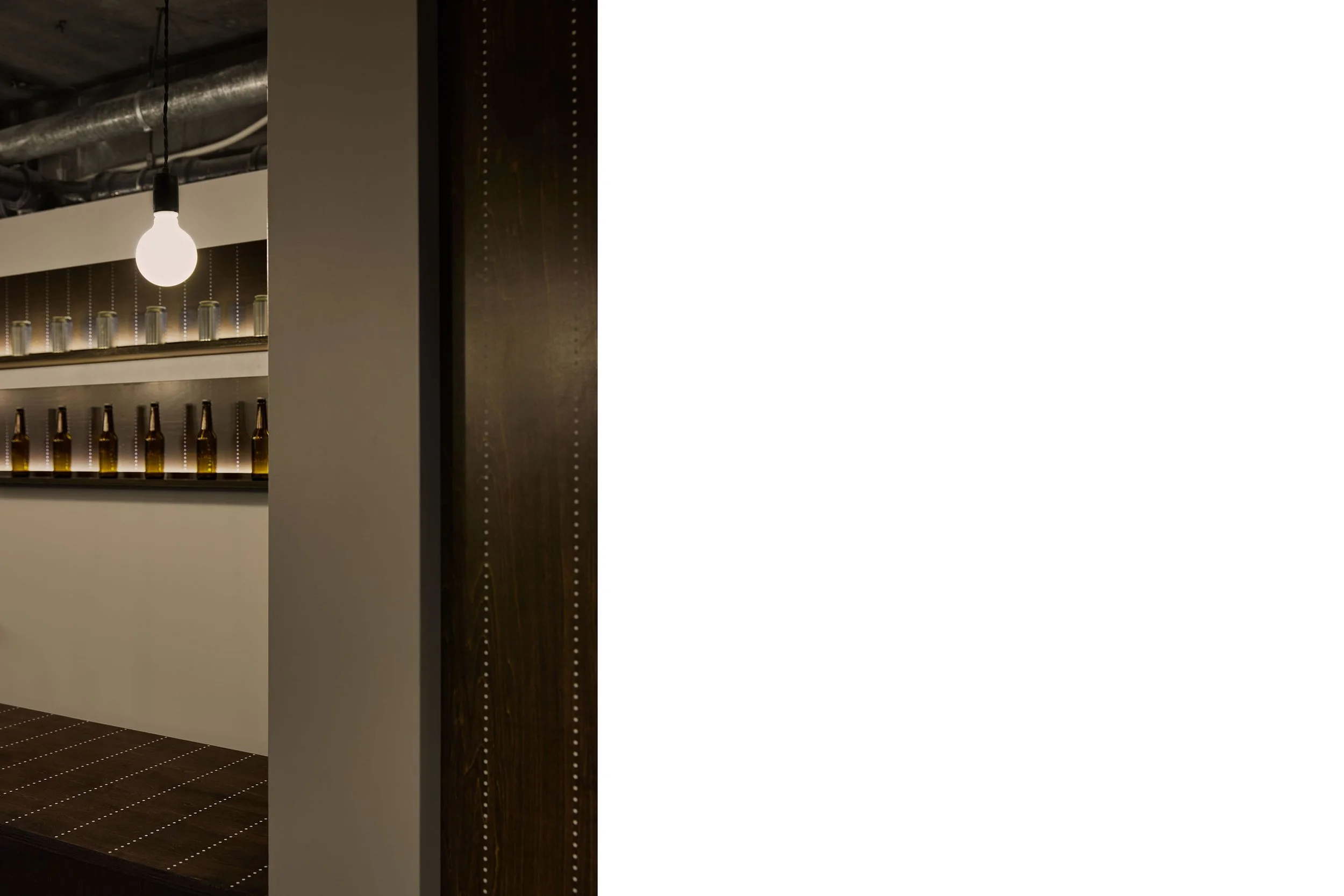
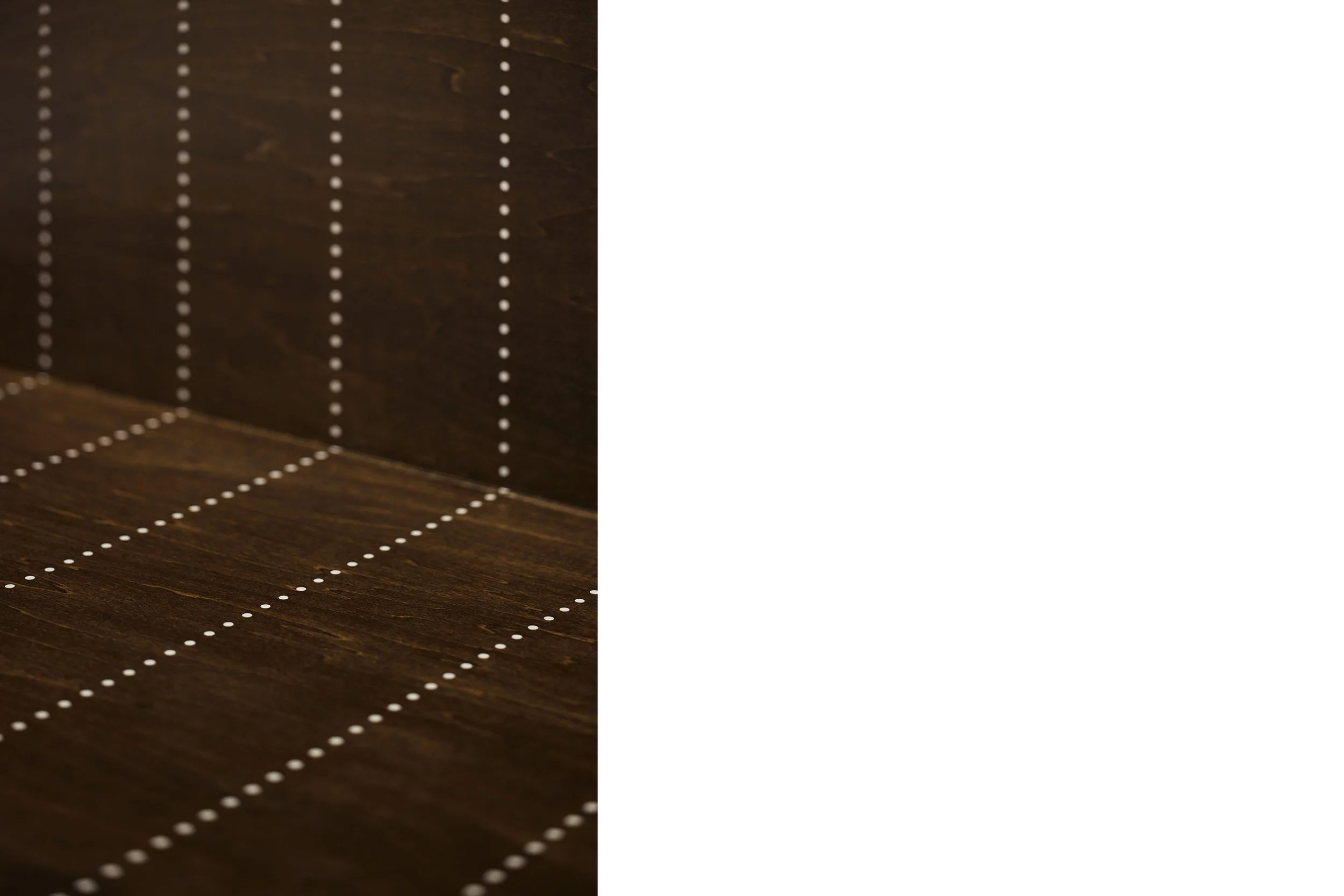
+αの要素として、スパイスの形状から"ドット"を、スパイスの運搬に用いる麻袋のデザインから"ライン"をアイコンとして抽出し、2つを組み合わせた"ピンストライプ"をモチーフとして什器や家具にシルク印刷した。
店内に点在するピンストライプがこの店らしさの表現となると同時に、ディズプレイを引き立てたり、テーブルや建具など何気ない存在のアクセントになる様に計画した。
店舗名は、この店の核である"spice"にモチーフの".(ドット=ピリオド)"をつけた"Spiced."とし、"スパイス"という名詞を"スパイス効いてます"という文章に変化させた。
空間にも店舗名にも、スパイスを効かせた店舗作りを目指した。
A restaurant focusing on spiced curry and craft beer, being run by an owner who has been involved in the culinary world for many years.
Having heard from the owner that he wanted young people, especially with an interest in food and health, to discover the appeal of spices, we decided to pack the place with a soothing color scheme which represent the owner's experience and expertise, while utilizing the existing skeleton space.
As an additional element, we extracted "dots" from the shape of spices and "lines" from the design of jute bags used to transport spices as icons, and silk-printed "pinstripes" combining the two on fixtures and furniture as a motif.
While the pinstripes scattered throughout the store are an expression of the store's character, at the same time, they are designed to complement the display and accentuate the tables, fixtures, and other ordinary objects.
The name of the store is made up with "spice", the core of the store, and the motif . (dot = period)", which is to be "Spiced." Here the noun "spice" has been changed into a sentence meaning "spicy."
The goal was to create a store with "spicy" space and name.
Spiced.
設計:イイジマデザイン 飯島靜
施工:ブラウン
撮影:ナカサアンドパートナーズ 末吉さくら
Spiced.
Interior design:Iijima Design / Shizuka Iijima
Construction:brown+
Photo:Nacasa & Partners / Sakura Sueyoshi